A brief introduction:
I am sharing this post today as a cornerstone of my journey. Although the article and the interviews mentioned here date back a few years, I wanted to bring them together in this “pillar” post. It marks the exact moment when my passion for color took a defined shape and professional expression—a foundation that continues to guide my work today.
Imagining new color harmonies is one of the aspects of my work that I love most.
Years ago, while collaborating with the Spanish ceramic glaze leader Esmalglass Itaca Grupo as Design and Marketing Manager for Italy, I was asked to write an article on the use and meaning of color in interiors. The target audience was the ceramic industry, reaching both specifiers and manufacturers.
At the time, the brand was pursuing a forward-thinking strategy to consolidate its role as a strategic mediator between B2B and B2C. Together with the Spanish headquarters and the editorial team, we decided to focus on the functional role of color: how it helps interpret space and influences the human psyche.
The Dynamics of Color: Harmony and Energy
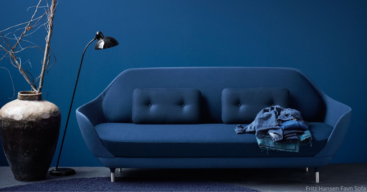
In that study, I explored harmonic color combinations and their vibrant energy. I used diverse examples, all sharing one common thread: they were the result of conscious, well-considered choices. Choosing a color should never be a matter of personal whim or fleeting trends; that is the only way to avoid “color fatigue” or unintended effects over time.
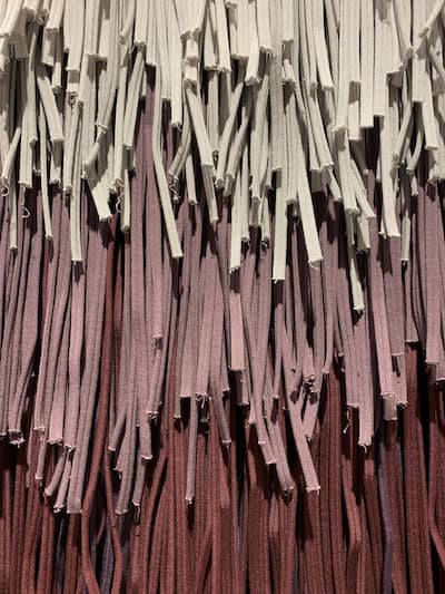 Environments characterized by harmonic balance are often composed of complementary colors (such as the primary triad of yellow, red, and blue). Conversely, a more serene atmosphere can be achieved through analogous colors—shades with a shared chromatic root, like yellow with green or red with pink. Here, the eye moves comfortably along a path drawn by a common hue.
A Network of Color Masters
If I were to write about color harmonies today, I would do so with even greater awareness, thanks to the network of architects and designers I have encountered over the years.
- Massimo Caiazzo: A master and friend, among Italy’s leading color experts. In our video interview, he explained how polychromy can be a form of healing and rebirth, following the teachings of the great Alessandro Mendini.
- Lia Luzzatto: A profound professional whose latest book, “I colori sono di tutti?” (written with Renata Pompas), is a masterpiece of design literature. Our exchange focused on color harmonies in fashion as a social expression of time.
- Mario Trimarchi: The architect who challenges the “planning” of color, bringing us back to Mother Nature. For Trimarchi, color is destiny. It is a gift from the material itself, not a superstructure dictated by trends.
Conclusion: Living Color
Respecting the dignity of matter means considering its own light and the changes that occur over time. It means treating materials as living entities to be experienced and understood.
How could I not love color? Beyond its depth of thought and aesthetic wonder, it has brought people of immense human and professional caliber into my life. It is a reminder that excellence in design is never a solitary pursuit; rather, it thrives on the constant exchange of ideas and shared expertise.
I truly believe that deepening our knowledge of such vital design themes is fundamentally tied to the quality of our professional relationships. For me, networking is not just about making connections—it is a conscious commitment to growth and a way to bring broader, more diverse perspectives into every project. It is through this collaborative spirit that passion transforms into high-level design.
.
Deep Dive: The Original Publication
If you would like to explore the full technical analysis and the visual examples from my study, you can browse the original article published in Ceramic World Review below.
Let’s Design with Color!